
BRAND AND
IDENTITY
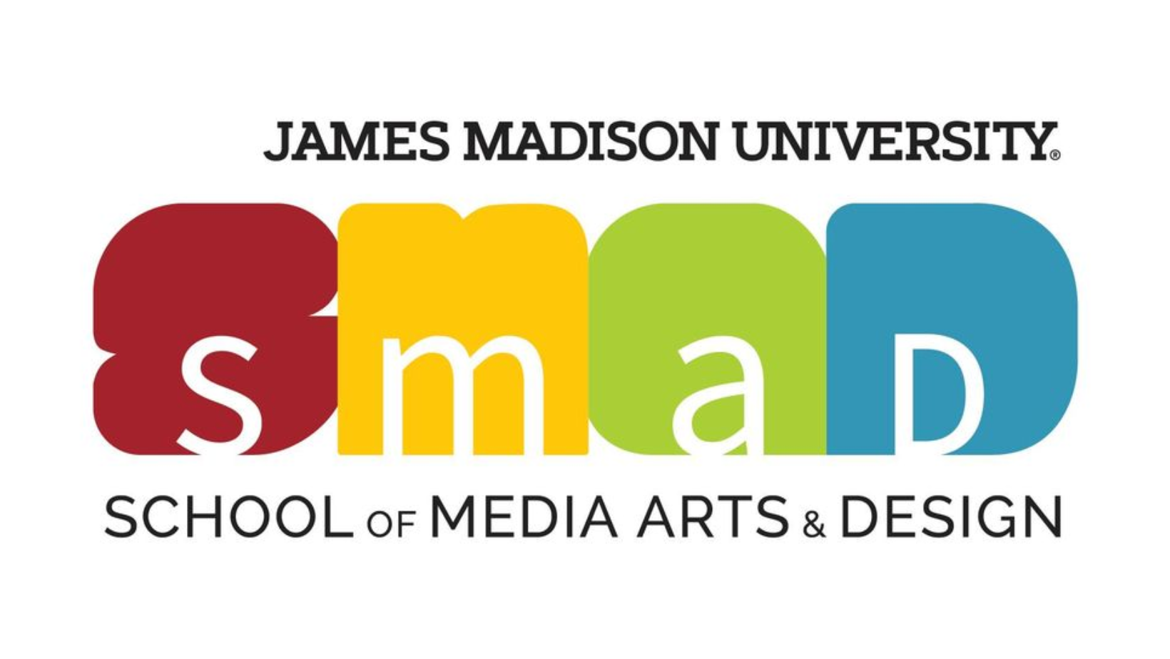
The School of Media Arts and Design needed a brand that could keep up with its creativity… and we made it happen.
For my Visual Communication Design class, we redesigned the logo and brand identity for the School of Media Arts and Design (SMAD) at James Madison University. The goal was to create a brand that reflects the creativity, collaboration and innovation of the students and faculty across the school’s four concentrations, while also showing that they interconnect and support each other.
The rebrand focused on storytelling and multimedia creation, aiming for a design that feels modern, bold, and dynamic. SMAD is always evolving with the media. It has movement, and it was important to show that in this rebrand. We wanted the brand to show that SMAD is more than just a school, but it is a collaborative environment where ideas are created and shared between students and faculty.
Our process involved researching the current brand, identifying its strengths and weaknesses and redesigning the visual elements (logo, color palette, typography) to better convey the school’s identity. We also created a comprehensive brand guide with information on how to use the logo effectively, alternative logos, patterns, and mockups. We presented the final brand guide and our design process to the SMAD department to support any of their future branding.
The final design is versatile, recognizable and reflective of the collaborative spirit of SMAD, while standing out on a national scale among other media arts programs.
See our Brand guide here!
BEFORE:

after:
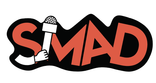
Journalism Logo
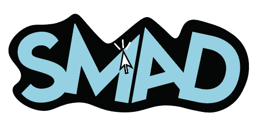
Interactive Design Logo

Digital Video and Cinema Logo
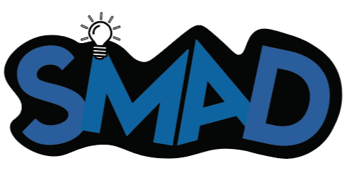
Creative Advertising Logo
Event
branding
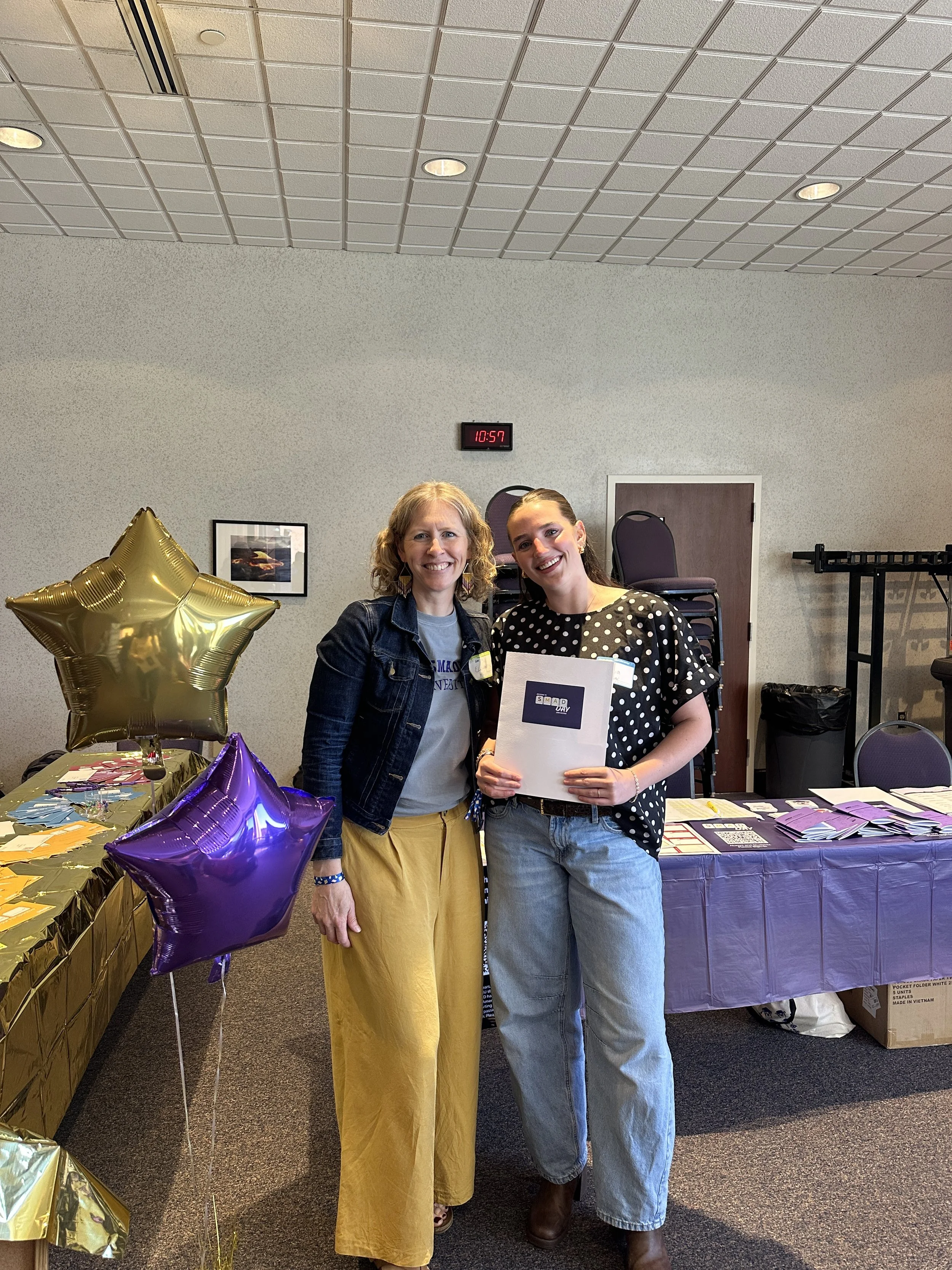
The School of Media Arts and Design also needed a brand and marketing for their annual SMAD Day networking event… and we took on the challenge.
For my Visual Communication Design class, we were tasked with creating a brand identity for SMAD Day, an annual networking event that brings together students, faculty, alumni, and local industry professionals. In the past, the event didn’t get much student attention, so our goal was to make it feel more inviting and actually get people genuinely excited about showing up.
We knew we needed something that felt relatable to everyone, no matter their age or background, while still communicating the purpose of the event. This project pushed us to think differently about what SMAD Day could look like and feel like. As a class, we landed on the idea of using simple keyboard controls to build inspiring and playful phrases and visuals. It was something everyone in SMAD interacts with every day, and we knew attendees would recognize and connect with it instantly. This idea opened the door to a creative and fun identity system with so many possibilities.
From there, my group and I had the role of shaping the look and personality of the brand. We designed the icons, patterns and overall visual direction that our classmates could use to create merchandise, social media graphics, and other promotional materials. We also created a full brand guide outlining typography, color palettes, logo usage and layout guidelines to ensure consistency across the board. It was so rewarding to see how everyone took the work we made and interpreted it in their own unique way.
By the end, we were able to give SMAD Day a fresh identity that felt more student-centered, more fun, and more reflective of the creative community we’re apart of. Seeing our brand come to life at the actual event was incredibly rewarding. Walking in and seeing pieces we had designed moths ago on posters, signage, and merch made all the work feel real and recognized.
see our brand guide here!

Mock Campaign for Glossier x Chamberlain Coffee
MOCK CAMPAIGNS

Mock Social Media Post for Summer Fridays “Mean Girls” Collection
Mock Campaign for Glossier x Chamberlain Coffee